How to Check If Your Cover Photo Wins the Click in One Minute Without Paying for New Photos
What if nobody opens my listing because the first photo is boring?
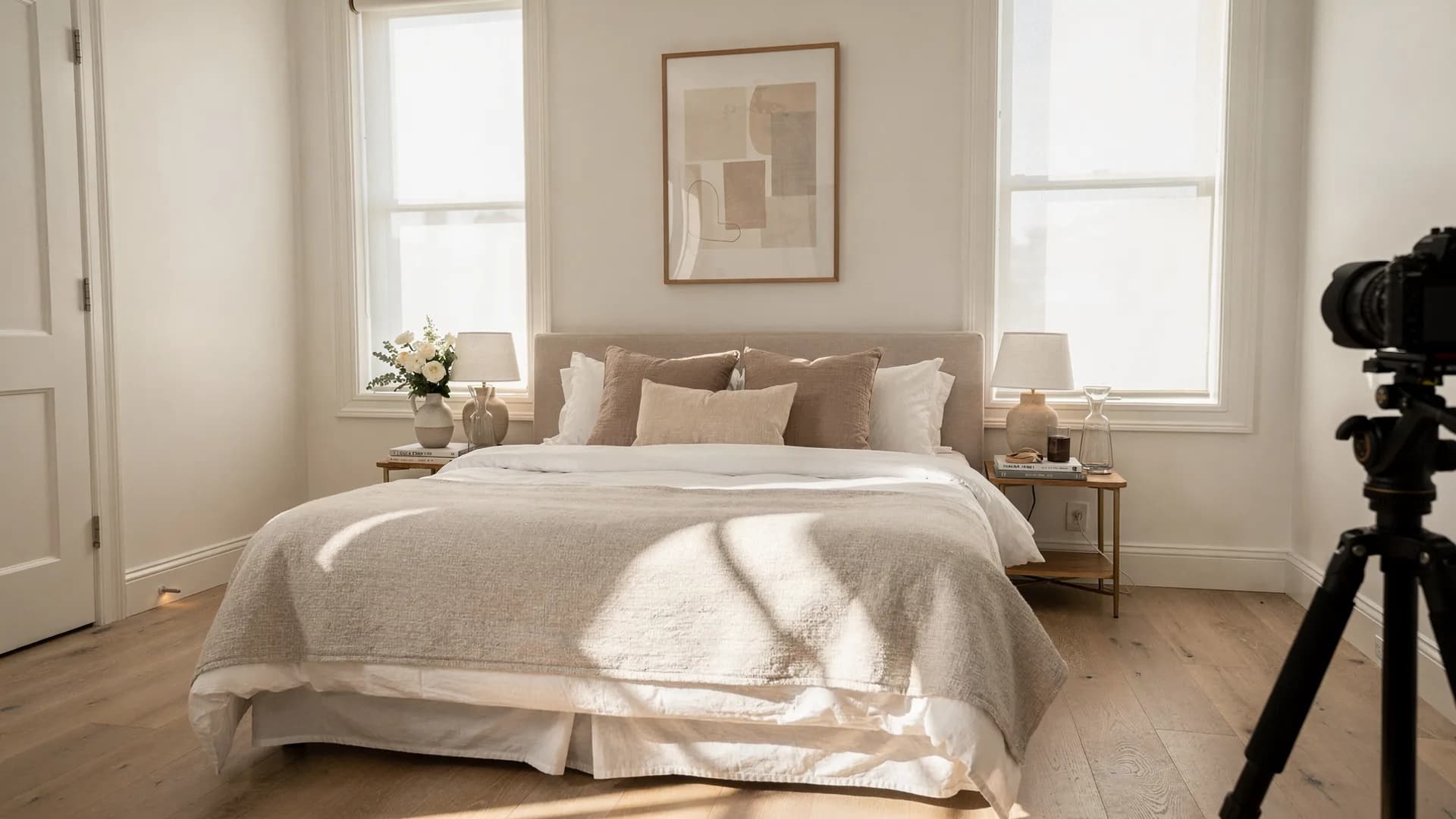
Guests do not reject your home first. They reject a thumbnail. That distinction should be liberating and instead it's infuriating, because you know what's behind the thumbnail. You know about the mattress you agonized over, the towels you upgraded after one lukewarm comment, the coffee setup that gets mentioned in every fifth review. None of it exists yet when a guest is scrolling. At search size, your entire property — the investment, the taste, the hundred small decisions — is a rectangle two inches wide, competing against forty other rectangles, judged by a thumb moving at the pace of someone flipping channels.
You already know exactly how this judging works, because you do it yourself. Think about the last time you booked a place to stay, or scrolled anything — apartments, restaurants, people. You weren't reading titles. You barely registered prices. Your thumb stopped for light, color, and one clear subject, and everything else got half a second. You didn't dislike the ones you passed. You never saw them. Not really — not long enough for dislike to register. That's the Scroll-By, and it is exactly what's happening to your listing right now, possibly hundreds of times a week.
Here's the uncomfortable confession most hosts won't make: you can spend $1,200 on furniture and still lose the booking to someone with better lighting and a cleaner thumbnail. Not a better property. A better two-inch rectangle. You do not have to buy new furniture to test that. Better listing photos can lift the light in the shots you have. That feels unjust, and honestly, it is a little unjust. It's also the single most fixable unfairness in this entire business — which is what the rest of this article is about. Airbnb's guide to helping a listing stand out starts with those photos, how search results work is the grid they compete in, and Vrbo's photo upload help tells hosts to keep at least six photos published.
The Job a Cover Photo Actually Has
A cover photo has exactly one job, and it isn't to summarize your property. It's to earn the click. Those are different tasks with different rules. A summary photo tries to show everything — the whole room, the whole layout, maybe two rooms stitched into one wide shot for efficiency. A click-earning photo shows one thing, clearly, with light and color doing most of the emotional work, because a thumbnail at search size has no room for nuance.
Most weak cover photos aren't badly composed. They're just doing the wrong job — trying to inform when they should be trying to hook.
Why The Wide Shot Feels Safer And Isn't
Hosts default to the wide summary shot for an understandable reason: it feels like the fairest, most complete representation of the property, and choosing anything narrower can feel like leaving something important out. But fairness and effectiveness aren't the same goal, and a cover photo only has one job to do. A guest scrolling search results isn't evaluating fairness. They're deciding, in a fraction of a second, whether this thumbnail is worth another moment of their attention at all — and a wide shot, compressed to search size, usually reads as a blur of competing details rather than one clear, inviting scene.
Hosts who run both versions for a few weeks each — same listing, same price, same season — tend to see the same result: the narrower, single-subject cover photo wins the click comparison, often by a wide margin. The wide shot isn't dishonest or badly composed. It's simply answering a question the guest hasn't asked yet. There will be plenty of time for the full layout later in the gallery. The cover photo's only job is to earn that later.
What Actually Stops a Thumb
Across the listings I've reviewed professionally, the covers that consistently win the click share a small set of traits: warm, directional light rather than flat overhead light; one clear focal point instead of a whole room crammed in; color that reads even when compressed to thumbnail size; and a sense that the shot was composed, not just taken. None of that requires professional equipment. It requires shooting at the right hour and choosing restraint over completeness.
This is the same underlying idea that runs through Your Airbnb May Not Be Broken — that the gap between a strong property and a quiet calendar often lives in a single image doing the wrong job, not in the property itself.
A Small Test That Settles The Argument
If you're genuinely unsure which of two candidate photos should lead, skip the debate and run a simple version of a preference test: text both images to five or six people who've never seen your listing, ask which one they'd click first if they saw it in a row of search results, and give them no other context. This isn't scientific, but it's more reliable than staring at your own photos and trying to imagine a stranger's reaction, because you already know too much about the property to see the thumbnail the way a stranger actually will.
Testing Your Own Cover Photo Honestly
The hardest part of this isn't technical, it's psychological. Hosts are attached to their cover photo the way people are attached to a profile picture — it's the one they feel represents them best, which is a completely different standard than the one that determines whether a stranger clicks.
Your cover photo isn't a summary of your home. It's an argument for the next three seconds.
A Fast, Honest Audit
Test your current cover photo against these
- Shrink it to thumbnail size on your phone and judge it at that scale — not full screen, where every photo looks better than it will in search.
- Check what time of day it was shot; anything under flat midday light usually reads as duller than the room actually is.
- Count the distinct objects competing for attention in the frame — more than two or three usually means no single thing wins.
- Compare it directly against five nearby competitors at a similar price, side by side, and ask which one you'd click first if you didn't already know which was yours.
- Ask someone outside the property to describe what the cover photo is "about" in one sentence — if they hesitate, the focal point isn't clear enough.
- Reshoot at golden hour if your current cover was taken between 11am and 3pm — the light difference alone often changes the click rate.
- Rotate your cover photo seasonally if your space changes meaningfully with light or décor, rather than leaving one shot up indefinitely.
One Photo, Tested Over Weeks, Not Minutes
Resist the urge to change your cover photo every few days chasing a feeling — that just resets whatever momentum the current one is building in search visibility and makes it impossible to know what's actually working. Pick one strong candidate, leave it in place for at least two to three weeks, and track views alongside bookings before drawing any conclusions. A cover photo test needs enough time to separate a real signal from the normal week-to-week noise every listing sees.
Most of the listings your own thumb has scrolled past in your life were not worse properties than the ones that stopped you. They were worse thumbnails — cover photos that hadn't been built to survive half a second of attention. Yours may be one of them right now. That's a fixable, specific, unglamorous problem, and it's usually a much smaller fix than you'd expect once you finally look at your own thumbnail the way a stranger actually does.
Published June 6, 2026 / 6 min
Related Reading
How to Fix Your First Five Airbnb Photos Tonight Without Hiring a Photographer
Your 27th photo can't rescue a weak first impression.
June 3, 2026
6 min
How to Brighten Dark Airbnb Photos in One Sitting Without a Full Reshoot
A dark photo can make a clean home feel old, cold, cramped, or forgotten.
May 27, 2026
7 min
How to Choose Between Fancy Photos and Honest Photos Without Lying About Your Place
Better photos should create desire and protect trust at the same time.
May 23, 2026
6 min